

How ODM Conveys Fresh & Reliable via Uniform Color Matching
Table of Contents
Display
I see how ODM uses uniform color matching to create a fresh & reliable appearance. When I choose colors for uniforms, I notice that blue often signals professionalism and builds customer trust. Bright colors like yellow and blue help employees feel more positive and engaged. I consider color a strategic branding tool because it reflects values and supports consistency.
Impact Area | Color Influence | Example Colors |
|---|---|---|
Customer Trust | Cohesive uniforms signal professionalism and attention to detail, enhancing trust. | Blue |
Employee Satisfaction | Bright colors promote positivity and engagement, improving morale. | Yellow, Blue |
Brand Identity | Color choices reflect brand values, ensuring consistency and credibility. | Green, Blue |
Key Takeaways
Uniform color matching enhances brand recognition and builds customer trust.
Blue uniforms promote professionalism and calmness, making them ideal for service industries.
Bright colors like yellow boost employee morale and engagement, creating a positive work environment.
Consistent color choices in uniforms help create a memorable brand image and encourage customer loyalty.
Involving employees in uniform color selection fosters a sense of ownership and boosts team morale.
Using the Pantone Matching System ensures color consistency across all uniforms, enhancing brand identity.
Classic uniform styles paired with consistent colors convey reliability and professionalism.
Proper care and storage of uniforms, such as using garment bags, maintain color vibrancy and extend garment life.
Uniform Color Psychology

Color and Trust
When I select uniform color for a team, I always think about how people react to different colors. I notice that color can shape how customers and employees feel about a brand. I see that blue is a popular choice for uniforms because it sends a message of trust and calmness. Many psychological studies show that blue helps people feel comfortable and secure. I read that blue in store logos makes customers believe the company is more reliable and professional. I also see that blue uniforms work well in industries where trust is important, like travel and customer service.
Blue for Reliability
I choose blue when I want to highlight reliability. Blue uniforms make employees look competent and trustworthy. I find that athletes who wear blue are seen as more reliable and calm. In my experience, blue also helps teams stay focused and professional. Thai Airways uses blue uniforms to show trustworthiness, which is important for travelers. I see blue used in HVAC and plumbing because these industries want customers to feel safe and confident in their services.
Tip: Blue uniforms create a sense of calm and trust, making them ideal for roles that require authority and reliability.
Freshness in Color Choices
I use green when I want to convey freshness and harmony. Green uniforms make people think of growth and health. Subway uses green uniforms to show their commitment to fresh ingredients. I notice that green also works well in therapeutic settings because it helps clients relax. Companies that care about the environment often pick green to reflect their values. I sometimes combine green and blue to create a look that feels both fresh and reliable.
Green is linked to growth, harmony, and freshness.
Blue represents trust, calmness, and professionalism.
Green uniforms are favored in eco-friendly and health-focused industries.
Employee Morale
I pay close attention to how uniform color affects employee morale. I see that the right color can boost mood and teamwork. When I choose blue, I notice that employees feel more relaxed and professional. Green helps create a balanced and healthy atmosphere. Red can increase energy, but I use it carefully because it may also raise stress levels. Black and charcoal gray give a sense of authority and sophistication, which works well in luxury or security roles.
Color | Psychological Effect |
|---|---|
Blue | |
Red | Increases energy and urgency, often used in fast-paced environments. |
Black | Conveys authority, sophistication, and strength. |
Green | Represents balance, health, and relaxation. |
I believe that uniform color should match the brand’s values and the emotions I want to inspire. I see that colors have psychological weight and can change how people feel at work. When I choose classic colors like blue and green, I help employees feel confident and united. This leads to better teamwork and higher productivity.
Fresh & Reliable Brand Image
Consistent Uniform Color
I always pay close attention to consistent uniform color when I want to build a fresh & reliable brand image. I see that using the same color palette across all uniforms helps customers recognize the brand instantly. When I walk into a store and see employees wearing matching uniforms, I feel a sense of trust and professionalism. Consistency in color makes the brand memorable and encourages customer loyalty.
Using a consistent color palette can boost brand recognition by over 80%.
Customers emotionally connect with brands that use the same colors in their uniforms.
People are more likely to remember brands associated with specific colors.
Consistent visuals build trust and enhance memorability.
I notice that uniforms shape first impressions. When employees wear uniforms with a unified color, customers see the company as organized and dependable. Uniforms also create a positive work environment, which can improve employee retention. I believe that a group uniform program offers a consistent branding experience and encourages repeat business.
Note: Uniform color consistency is not just about looking good. It helps build emotional connections with customers and strengthens loyalty over time.
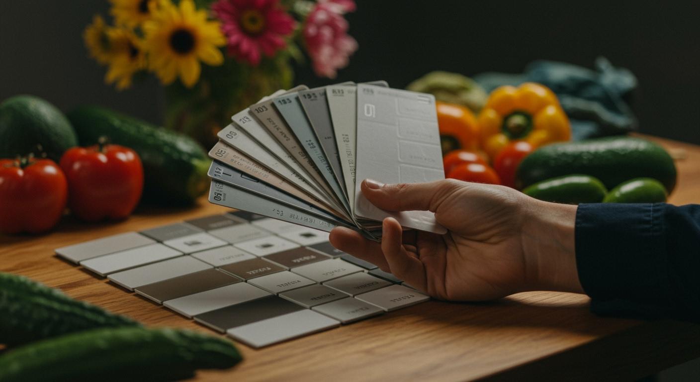
To achieve true color consistency, I rely on the Pantone Matching System. Pantone provides standardized color references, so every uniform looks the same, no matter where it is produced. Pantone’s system ensures that graphics print uniformly and true to their original specifications. I use Pantone’s digital tools to check and adjust colors before production. This process guarantees that all suppliers deliver the same results, keeping the brand image fresh & reliable.
Classic Styles
I choose classic uniform styles when I want to convey reliability and freshness. Classic styles never go out of fashion. They look formal and professional, which helps customers trust the brand. I see that modern styles appeal to trendy establishments, while rustic styles suit family-friendly environments. I prefer classic styles because they work well in most settings and always look polished.
Green suggests freshness and eco-friendliness.
Black conveys sophistication and elegance.
Red stimulates appetite and creates urgency.
Classic styles enhance perceptions of professionalism. When employees wear uniforms with timeless designs, customers feel confident in the brand’s ability to deliver fresh & reliable service. Uniforms also promote unity among employees, which leads to better teamwork and higher retention rates.
Tip: Classic uniform styles paired with consistent color choices create a strong and lasting brand image.
I see that uniforms say a lot about the companies they represent. A fresh & reliable brand image starts with thoughtful choices in uniform color and style. When I combine classic styles with consistent colors, I help the brand stand out and build lasting relationships with both employees and customers.
Uniform Color Selection
Brand Alignment
When I select a uniform color for a team, I always start by thinking about the brand. I want the uniform to reflect the company’s personality and values. I look at what makes the brand unique. I study the industry and check what colors other companies use. I know that color can change how people feel about a brand. I want the uniform color to make customers feel welcome and employees feel proud.
I follow these steps when choosing a uniform color that matches the brand:
I understand the brand identity. I ask what the company stands for and what message it wants to send.
I research the industry and market. I look for color trends and see what works for similar businesses.
I consider the psychological impact. I think about how each color makes people feel.
I check practical details. I want the uniform color to be easy to clean and keep looking fresh.
I ask employees for feedback. I want them to feel comfortable and confident in their uniforms.
I test different colors. I gather feedback before making a final choice.
Tip: Involving employees in the decision helps create a sense of ownership and boosts morale.
I believe that a strong brand starts with a thoughtful uniform color selection. When I match the uniform color to the brand’s values, I help build trust and loyalty.
Adaptable Combinations
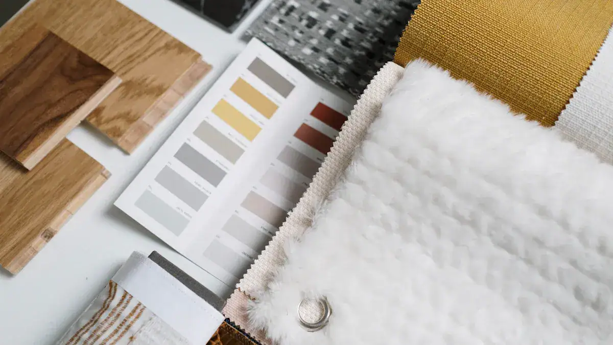
I always look for color combinations that stand the test of time. I know that classic colors like navy blue, gray, black, and white work well for uniforms in service industries. These colors help the brand look professional and trustworthy. I see that navy blue gives a sense of reliability. Gray feels neutral and modern. Black adds elegance, while white looks clean and fresh.
I often mix these colors to create a uniform that fits many settings. For example, navy blue pants with a white shirt look sharp and neat. Black jackets with gray accents give a polished appearance. These combinations work for many brands and never go out of style.
Color Combination | Impression | Best For |
|---|---|---|
Navy Blue + White | Reliable, Fresh | Retail, Hospitality |
Black + Gray | Elegant, Modern | Security, Luxury |
Gray + White | Neutral, Clean | Healthcare, Service |
I choose adaptable combinations because they help the brand stay consistent as trends change. I want the uniform to look good year after year. When I pick timeless colors, I make sure the brand always feels fresh and reliable.
Color Consistency
Pantone Matching System
I rely on the Pantone Matching System when I want to guarantee color consistency in uniforms. Pantone guides help me select exact shades, so every uniform matches perfectly. I always communicate Pantone codes to suppliers and manufacturers. This step makes sure everyone uses the same reference and avoids mistakes. I use Pantone swatch books to compare samples and confirm the right color before production starts. When I follow this process, I see that uniforms look the same across different batches and locations.
I notice that technology has made color matching easier and more reliable. High-resolution imaging captures tiny details in color, and AI helps inspect color differences with great precision. Machine learning algorithms analyze variations and improve quality control. These advancements reduce human error and save time. I see less waste and fewer reworks, which supports sustainable production.
Tip: Always provide Pantone codes to your suppliers. This step helps maintain brand identity and prevents mismatched uniforms.
Feature | Description |
|---|---|
Provides an objective and repeatable process for color matching, eliminating inconsistencies. | |
Efficiency and Cost-Effectiveness | Streamlines the color matching process, reducing time and labor costs. |
Reduction in Waste | Minimizes rework and waste, contributing to sustainable production practices. |
Supplier Standards
I work closely with suppliers to keep color standards high. I set clear expectations for color matching and quality control. I ask suppliers to use tools like Pantone color books and color spectrometers. These tools help them reproduce colors accurately and prevent mismatched shades. I approve pre-production samples before mass production begins. This step sets a benchmark for color and quality.
I inspect raw materials to make sure they match color specifications. I conduct regular quality checks during production. If I find any color discrepancies, I correct them right away. I align my standards with suppliers to reduce risks and keep every uniform consistent.
Description | |
|---|---|
Standardized inspection of raw materials | Ensures that raw materials are free from defects and match color specifications before production begins. |
Approval of pre-production samples | Establishes a benchmark for mass production, ensuring that all products match the approved samples in color and quality. |
Regular quality inspection of production | Conducts inspections at various stages to identify and correct any color discrepancies during the manufacturing process. |
Align standards with suppliers | Ensures that suppliers adhere to the same quality standards, reducing the risk of color inconsistencies in raw materials. |
I believe regular audits and feedback help me improve color consistency. I measure the number of inconsistencies in audit reports every quarter. This process helps me catch problems early and make adjustments.
I set clear standards for color matching.
I use systematic inspections at every stage.
I improve processes through regular audits and feedback.
Note: Consistent color in uniforms builds trust with customers and keeps the brand image strong.
Garment Bags and Uniform Care
Maintaining Freshness
I always use garment bags to keep uniforms fresh during storage and travel. When I store uniforms, I want to avoid dust and pest protection issues. I choose the right bag for each garment because I know that different materials need different care. Muslin garment bags, made from 100% cotton muslin, give a breathable and acid-free protective cover. This type of bag shields uniforms from light, humidity, and environmental contaminants. Tyvek garment bags offer waterproofing while staying breathable, so condensation and moisture do not build up inside the bag. I use non-woven polypropylene garment bags for their durability and breathability, which helps prevent mold and mildew.
When I travel with uniforms, I rely on garment bags to keep everything organized and clean. I never want to arrive at an event with wrinkled or musty uniforms. I pack each garment in its own bag, which keeps it separated and protected. I find that garment bags with a moisture and odor barrier work best for long trips. I always check that the bag zips securely and has a sturdy handle for easy travel. For storage at home or work, I hang garment bags in a cool, dry place. This method keeps uniforms fresh and ready for use.
Muslin bags protect against light and humidity.
Tyvek bags provide waterproofing and breathability.
Non-woven polypropylene bags prevent moisture buildup.
Tip: Always use a garment bag for each uniform to maintain freshness during storage and travel.
Protecting Uniform Color
I know that garment bags play a big role in protecting the color of uniforms. When I store uniforms in a bag, I reduce the risk of fading and discoloration. I always wash cotton and cotton blends in cold water and use a mild detergent without bleach. This keeps the color vibrant. I air dry uniforms or use a low heat setting to avoid shrinkage and color loss. For polyester and synthetic garments, I wash in cold water and use a detergent made for synthetics. I hang dry or tumble dry on low to keep the fabric strong.
Professional laundry services help me maintain color integrity. They use advanced cleaning methods for each garment type. They avoid overwashing and use targeted stain removal, which keeps the fabric and color safe. Proper finishing techniques help uniforms keep their shape and appearance. I trust these services to use temperature-controlled equipment and fabric-safe detergents, which preserve color vibrancy.
When I travel, I always use garment bags to shield uniforms from sunlight and environmental stress. I never store uniforms in direct sunlight, as this can cause fading. I lay delicate garments flat in their bags and avoid overcrowding. This practice keeps each garment looking new and extends its durability.
Professional care prevents wear and fading.
Proper storage in garment bags maintains color consistency.
Note: Consistent use of garment bags and careful garment care routines help uniforms stay fresh, vibrant, and reliable for every travel or storage need.
Employee and Customer Impact
Confidence and Cohesion
When I choose employee uniforms with matched colors, I notice a big change in how my team feels and works together. I see that wearing the same uniform helps everyone feel like part of a group. This shared identity builds camaraderie and unity. I watch my team members support each other more when they dress alike. The uniform becomes a symbol of belonging, and I see job satisfaction rise.
Uniforms create a shared identity, which fosters camaraderie and unity among team members.
I notice that employee uniforms act as a strong motivator, leading to higher job satisfaction and a sense of belonging.
Uniforms show visual unity, which enhances collaboration and mutual respect within teams.
Wearing the same uniform makes everyone feel part of something bigger, promoting camaraderie.
Teams with shared attire work together more harmoniously, which boosts overall team cohesion.
I believe that color matching in employee uniforms does more than just look good. It helps my team feel confident and proud. When everyone wears the same color, I see fewer barriers between people. The team works together smoothly, and morale stays high. I find that a unified look encourages respect and trust among employees.
Tip: Matching uniform colors can turn a group of individuals into a strong, united team.
Customer Perception
I pay close attention to how uniform color matching affects customer perception. I see that customers form opinions quickly based on what employees wear. Uniform color consistency shapes how customers view my business. When my team wears matching uniforms, customers feel that we are professional and organized. This positive perception leads to greater trust.
Uniform color choices send messages about my brand. Blue uniforms make customers feel safe and welcome. Red can boost confidence and energy. I notice that the right colors influence customer emotions and create a strong brand image. Customers trust my team more when they see a consistent look. This trust makes them more likely to return and recommend my business.
Customer perception is not just about appearance. It is about how customers feel during every interaction. I see that matched uniforms help customers relax and enjoy their experience. They know what to expect, and they feel comfortable. I believe that color matching in employee uniforms is a simple way to build trust and loyalty.
Uniform Color | Customer Perception | Brand Message |
|---|---|---|
Blue | Trustworthy, Calm | Professional, Reliable |
Red | Confident, Energetic | Bold, Dynamic |
Green | Fresh, Relaxed | Healthy, Eco-friendly |
Note: Uniform color matching is a powerful tool for shaping customer perception and building lasting trust.
Implementation Steps
Getting Started
When I help an organization implement uniform color matching, I always start with a clear plan. I want every step to support the brand and make the process smooth for everyone involved. Here is how I approach the process:
Align with Brand Values: I make sure the uniform color reflects the brand’s personality and message. I ask what the company wants to communicate to customers and employees.
Ensure Practicality and Comfort: I select fabrics and designs that feel comfortable for employees. I test samples to check for fit and ease of movement.
Consider Inclusivity: I look at the needs of all employees. I offer different sizes and styles so everyone feels included.
Wash and Wear Testing: I test the uniforms for colorfastness. I wash samples and expose them to sunlight to see if the color stays vibrant.
Sweat Resistance Tests: I check how the color holds up under perspiration. I want uniforms to look fresh even after a long shift.
Adopt Industry-Recognized Processes: I use dye-sublimation for bright, long-lasting colors. I also consider eco-friendly dyes to show the brand’s commitment to sustainability.
Use a Consistent Monitoring System: I calibrate color-matching tools and set up quality control checkpoints during production.
Collaborate with Reliable Manufacturers: I work with trusted suppliers who understand my quality standards and can deliver consistent results.
Incorporate Employee Feedback: I ask employees for their opinions on comfort and style. Their feedback helps me make better choices.
Maintain Core Design Elements: I keep key design features so customers still recognize the brand, even if I update the look.
“A well-executed uniform program is essential for conveying a company’s brand identity and creating a positive first impression for customers.”
Overcoming Challenges
I know that even with a good plan, challenges can appear. I prepare for common issues and use proven solutions to keep the project on track.
Challenge | Solution |
|---|---|
Fit samples and sizing guides. | |
Inventory surplus or shortage | Smart inventory systems. |
Employee compliance | Clear policies and easy ordering platforms. |
Budget constraints | Phased rollouts and volume discounts. |
I often face sizing problems. I solve this by providing fit samples and detailed sizing guides. When inventory issues arise, I use smart inventory systems to track stock and avoid shortages or excess. For employee compliance, I set clear uniform policies and use simple online ordering platforms. If the budget is tight, I recommend rolling out uniforms in phases and negotiating volume discounts with suppliers.
I also focus on communication. I explain the reasons for uniform changes to both employees and customers. I highlight the benefits, such as improved comfort and a stronger brand image. I listen to feedback and make adjustments when needed. By staying flexible and proactive, I help organizations create a uniform program that feels fresh, reliable, and true to their brand.
I see uniform color matching as a powerful way to show freshness and reliability at ODM. When I choose the right colors, I help my team feel confident and united. Customers trust our brand more when they see professional uniforms. Studies show that color can boost performance, team cohesion, and customer trust.
Benefit | Description |
|---|---|
Improved Performance | Red uniforms can increase win rates and individual success. |
Enhanced Team Cohesion | Matching colors strengthen unity and collaboration. |
Increased Customer Trust | Professional attire reassures customers and builds confidence. |
I encourage you to try these strategies in your own organization. For more learning, I recommend exploring research in Management Decision, Marketing Theory, and the Journal of the Academy of Marketing Science on color psychology and branding.
FAQ
What is uniform color matching at ODM?
I use uniform color matching to make sure every employee wears the same shade. This process helps our brand look fresh and reliable. I check colors with Pantone codes and work with suppliers for accuracy.
Why do I choose blue for reliability?
I pick blue because it signals trust and professionalism. Customers feel safe when they see blue uniforms. I notice that blue helps my team stay calm and focused.
How does color consistency affect customer trust?
I see that consistent colors make customers believe in our brand. Uniform colors show we care about details. Customers remember us and return more often.
Note: Consistent colors build strong brand recognition.
What tools do I use for color matching?
I rely on Pantone Matching System and color spectrometers. These tools help me select exact shades and avoid mistakes. I always share Pantone codes with suppliers.
How do garment bags protect uniform color?
I use garment bags to shield uniforms from light, dust, and moisture. This keeps colors vibrant and prevents fading. I choose breathable bags for long-term storage.
Can I update uniform colors without losing brand identity?
I test new colors with employees and customers. I keep core design elements the same. This way, I refresh the look but maintain brand recognition.
Tip: Always involve your team when updating uniform colors.